-
Architects: Chan Architecture
- Year: 2014
-
Photographs:Folded Bird Photography (Brendan Finn)

Text description provided by the architects. Renovating and extending a typical Victorian terrace always poses a unique set of challenges. The blocks are often long and narrow, with a symmetrical arrangement of period-style bedrooms at the front of the house divided by a central corridor, leading out to a small lean-to structure that was typically constructed in the 1960s and 70s. This creates a house that has the 'nice' part of the house at the front, whereas the rear living spaces are often small, dark, cramped and often awkwardly planned.

So the main challenges with any extension such as this are firstly how to seamlessly transition from the old part of the house to the new, and how to create a sense of spaciousness and light in the new living spaces, whilst sill respecting the original building.

Our approach was to firstly separate the new and the old via the insertion of a black timber-lined box, containing the two bathrooms on both sides accessed via hidden doors. This created a clear visual break between the new and the old, as well as create a sense of drama when one walks through the dark corridor with the lowered ceiling into the new light-filled living space.

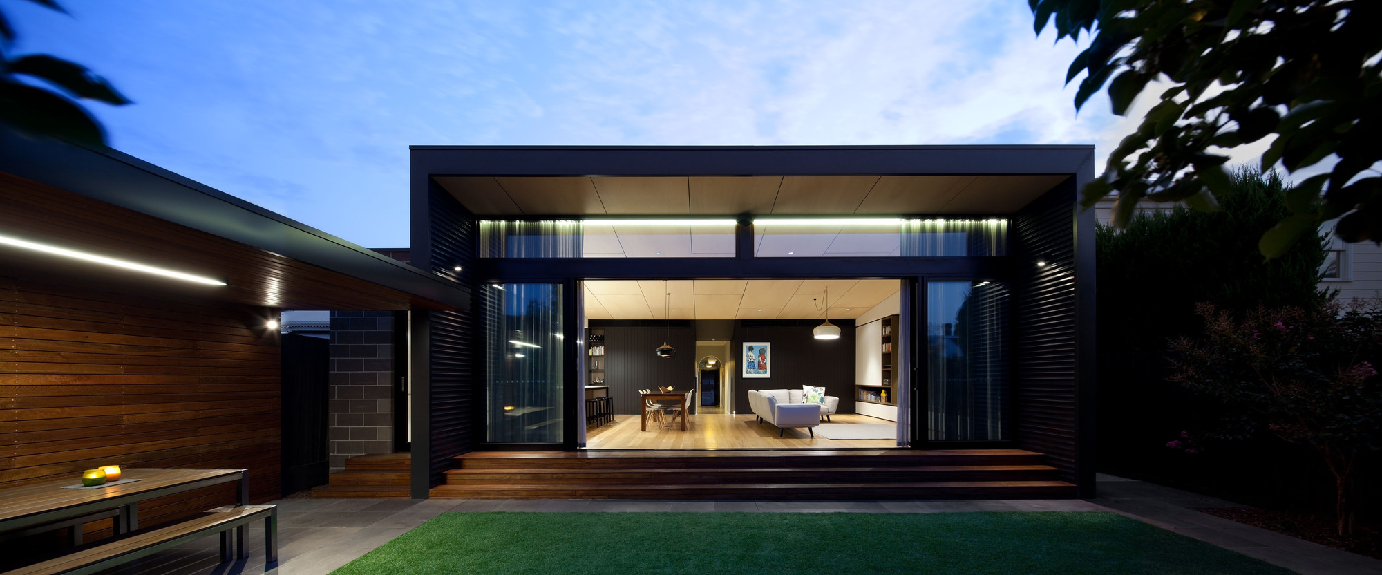
The new living area opens up towards the garden, via a raked ceiling and fully openable stacker doors to allow the backyard to be part of the house, allow sunlight to penetrate into the living spaces in the winter months, and allow for natural ventilation to run through the entire house.

Whilst the living, dining and kitchen areas are part of the same area, they have been defined by the pendant light fittings, furniture and soft floor furnishings.
The material palette was carefully chosen to provide softness and warmth to the clean lines of the design, by using natural materials such as plywood on the ceiling, the sheer linen curtains and the blackbutt flooring. At the same time the detailing was carefully considered via concealed pelmets for furnishings and lighting, concealed fixings of ceiling linings, flooring and joinery, and minimal use of handles so as to not distract from the form and expression of the design.


From a sustainability perspective, passive design principles were adopted throughout, including shaded double glazed windows to the north preventing heat in the summer and allowing sunlight in the winter, large openable windows on opposite ends of the house for natural ventilation, recycling water from the roof and laundry, solar panels to generate power and extensive insulation and sealing to prevent heat loss. This all combines to create a dwelling that requires almost no artificial heating or cooling.

Often the simplest concepts require the most consideration to allow the ideas to flow through from the overall vision to the smallest details. Simple clean lines with carefully detailed junctions, a balanced selection of materials and colours, proper orientation and integration of sustainability principles can create a home that is modern, comfortable, and most importantly, livable.


